It’s been a bit quiet around here recently because we’ve been hard at work on a beautiful redesign of the Decorator’s Notebook blog. It’s taken a bit longer than we’d hoped (apparently this is the biggest blog our hosting team have ever had to migrate… oops!) but we’re so pleased to unveil our new design and invite you to our new blogging home…
We hope you’ll like the clean new layout, bigger pin-ready pictures and useful new features, like the ‘Make and Do’ menu which makes it easier to find a craft project or recipe to try, or an inspiring home tour to explore…
We’re not setting the new blog design in stone yet though… making sure that you like the changes we’ve made is really important to us so we’d love to hear your feedback (good and bad).
Do you like the new features?
Is there something we’ve removed that you miss?
Have you seen something cool elsewhere we should add?
In a couple of days visitors to this web address will be automatically redirected to the new blog, and if you follow us and receive new post updates via email we’ll transfer your subscription over.
Please be sure to update your settings so you don’t miss out… Decorator’s Notebook is about to get bigger and better than ever before and we can’t wait to start this new journey with you!
I have a little nugget of good news today – I’m soon moving houseagain and this time I’m going to have a garden! Maybe it’s the spring sunshine, but I’m getting super excited about this prospect. Until now, a few disasterous months of allotmenteering and three window boxes are the closest I’ve ever come to having my own patch and, needless to say, a ‘garden on a shoestring’ Pinterest board is already taking shape.
This contemporary concrete planter DIY shared by my friend Heather is one I’m definitely going to try. Mix together a bag of cement, pour into old plastic buckets, add a pinch of interior stylist’s instinct and voilà!
I shared one photo from this apartment on Twitter last week and the response was an immediate ‘wow’, so I thought you’d like to see the rest!
The owners of this one-bed apartment have achieve the renovation holy trinity: bigger, lighter and on a budget. Have a browse and soak up the cool mix of whitewashed brick, tile and dark reclaimed wood. Then check out the ‘befores’ to appreciate just how impressive this makeover really is!
The apartment belongs to New York prop stylist Anthony D’Argenzio who did most of the work himself. Once the previous owner’s frilly pink pelmets and plastic-covered sofa had been banished he began by hacking the plasterboard from the walls to reveal the brick underneath. Whitewashing the rough brick and outlining the windows with a deep surround of stained reclaimed wood gives the apartment a warehouse-like feel.
This kitchen is just a dream for me… the patterned tile floor, white marble worktop, subway tiles, industrial lighting and all that rough-hewn reclaimed wood. Perfect proof of how a tiny kitchen can still be big on style.
Another thing I really admire about how this place has been styled is the juxtaposition of the industrial backdrop with quite glamourous accessories and furniture. The ornate gilded mirror in the living room, chandeliers and slightly rubbish society portraits all give an unexpected hint of faded grandeur that stops the coolness feeling too try-hard.
If you like this home you won’t want to leave the blog without looking around this apartment too… there are some lovely similarities between the two in both size and style. And don’t forget to check out the ‘befores’ too… you won’t believe your eyes!
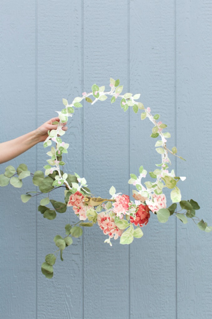
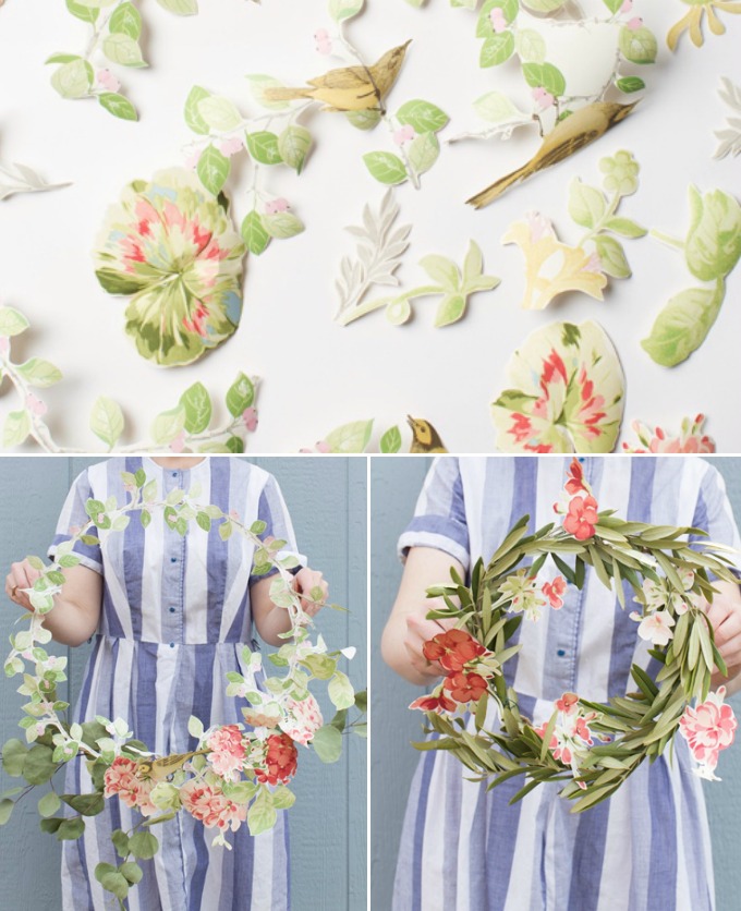
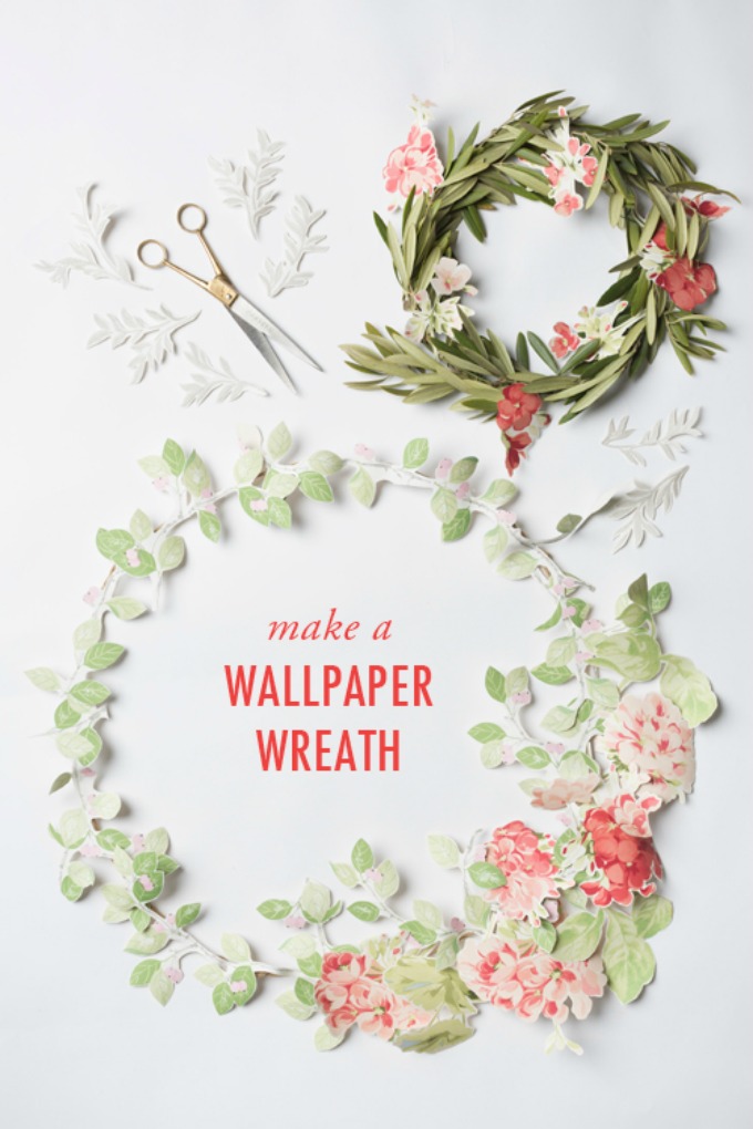
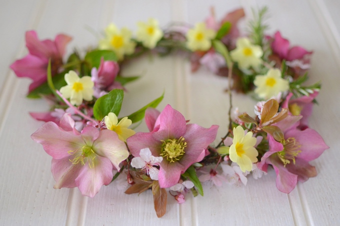
I loved creating my flower crown from garden blooms and blossoms last week but was a little sad to find it didn’t last more than a few hours. Today I came across this beautifully simple craft project by The House That Lars Built and thought my fellow floral craft fans might be keen to try it too!
It’s a great way to use up offcuts of wallpaper, which I always feel bad about throwing away. If you don’t have any that are right though, wallpaper shops will usually provide free samples – ask them to give you a piece large enough to show the whole repeat and it will probably be big enough to make this. The wallpaper used here is from Laura Ashley.
There’s no escaping the specialness of this time of year. I was really touched by the collective enthusiasm for making beautiful flower crowns last week for the spring equinox – crafting and wearing my crown really put me in the mood for positive thinking and a new perspective that comes with the seasonal shift. And this weekend the clocks go forward too – the loss of an hour’s sleep is a small sacrifice for the longer days we can enjoy over the coming months.
Today’s Mood of the Moment really captures the spirit of springtime for me… flowers, lambs, fresh air and lighter clothing are all symbols that mean the world to me, especially since this is the first spring in seven years I’ll be spending back in the countryside where I belong. Take a moment for yourself to sit back and enjoy this lovely uplifting tune by Chloe Charles, discovered by our Dad and recommended to us.
It all started with a Friday afternoon twitter chat. You know the sort: when everyone’s an hour or so away from pouring their first G&T and avoiding the last few tasks they should be finishing for the week.
The conversation turned to having pictures of ourselves on our blogs. If you’ve been reading for a while, you might know that I wrote Decorator’s Notebook anonymously for the first two years, without my name, let alone with a mug shot looking out top right. There was some discussion around how posting a ‘blogger’s selfie’ can feel like a horribly awkward and self-conscious thing to do. But for me, it was actually one of the most important moments for me and my blog. Until I ‘came out’ I didn’t realise how detached I’d felt from the blogging community and how much I’d been holding back for years. The second I posted a photo of myself and wrote a proper ‘about me’ was the moment Decorator’s Notebook actually felt like mine.
One of the blogger profile pictures I like best in all the world is Michelle’s – go and check it out and see how the idea for #primaveracrowns was born! So, here’s my contribution… a simple garland of flowers from my Mum’s garden to celebrate the start of spring. Is anyone joining us? You know what, it doesn’t really matter. Because this is me, wearing my crown, on my blog. And I’m proud and happy to be here.
HOW TO MAKE A SPRING FLOWER CROWN
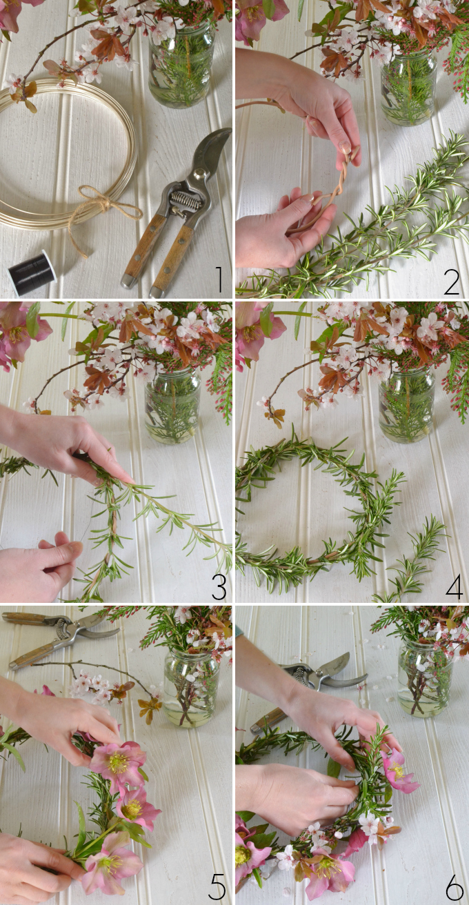
1 | Gather your supplies: thick wire (the rubber coated sort used for garden ties works well), some thin beading wire, secateurs and a selection of freshly-cut flowers and foliage. I used rosemary, hellebores, cherry blossom, primroses and grape hyacinths.
2 | Twist the thick wire into a circle just a little larger than you want it to be once it’s on your head – the finished crown will fit a little more snuggly once it’s filled out with flowers.
3 | Start by covering the wire with foliage. Something quite dense that comes in long stems will make this easier. Tuck the end into one of the twists in your wire then gently wrap the stems around, securing it every now and then with beading wire.
4 | This is where you want to end up – an evenly covered base on which to build. Now the fun begins!
5 | Add your flowers, starting with the bigger ones. Hold the stems in place with one hand while you secure them with beading wire with the other. If you want to get all florist-y about it you could use special wire and tape (see how here) but I find my way a lot less faff! How you position the flowers is completely up to you… I went for even spacing all the way around but something asymetric can look wonderful too. Head to my flower crown inspiration board for lots of ideas.
6 | Once your big blooms are spaced as you’d like, add in the smaller ones using the same technique, filling any gappy bits as you go.
An important note: soft-stemmed wild or garden flowers like these don’t like being out of water for long, so you’ll need to make your crown soon before you want to wear it or it will look wilted and sad! For a longer-lasting flower crown, choose blooms with woody stems like roses and eucalyptus – these will last overnight if spritzed with water and stored in a plastic bag in the fridge.
If you’ve made a flower crown with Michelle and I, please post your photos to Twitter, Facebook or Instagram using #primaveracrowns and add your link below. We can’t wait to see them!
I met weave designer Eleanor Pritchard at Maison et Objet a couple of years ago and immediately fell for the vibrant colours and intricate patterns of her traditionally-woven Welsh blankets. Joe and I called in on Eleanor and her assistant Holly as they were hard at work on designs for their new collection to explore her South London studio and find out more about the inspirations behind her work.
Tell us what you think of our first video too!
Where did you learn your craft?
I initially did a history degree and worked in bookselling and publishing for a while. I went back to college as a mature student and studied weaving for a second degree. I had always loved making things, but going back to college really gave me the skills to develop my own design process as well as the technical grounding in weave. I studied Textile design, specializing in weave at Chelsea and set up my own studio almost as soon as I left college, with a helping hand from the Crafts Council who gave me a grant to buy my first loom. For a number of years I taught at Central St Martins alongside my studio practice, but now work on my weaving business full time. Our blankets are sold in 25 countries, and we have also just launched an upholstery line so there’s plenty to keep us busy.
Talk us through your design process when you work on something new…
I always start by making a storyboard, which can contain anything from postcards and drawings to bits of packaging and postage stamps. Once the ideas come together I begin sampling on the Dobby loom I have here in my studio. I often thread it with different colourways in the warp so we can try several options at once. When I can see what’s working well, I weave a larger sample of the ones I like the look of.
The loom looks very complicated! How do all these threads actually become a woven fabric?
Looms work on the principal of binary codes… the first computers were actually based on looms. The woven pattern comes partly from the order you thread the loom up in and partly from the order you lift the warp threads up and down in as the weft passes through. A lot of the planning happens before you even start, and with experience you get to learn what will happen when you thread the loom in a certain way. You need to follow certain rules to make sure that the fabric has a structure that will hold together, but there’s still lots of room to experiment. I enjoy the discipline of working within those parameters.
Do you weave each blanket here, by hand?
Not anymore. I sample the new designs here on my hand-operated loom, then the blankets are woven in a mill in Carmarthenshire in Wales using a power loom. A power loom works the same way but is much quicker. It’s an area where weaving used to be a huge industry – the steep little valleys were filled with hundreds of water-powered mills – but now the mill I use is one of the only ones left.
How important is tradition in your work?
I am very interested in vernacular British textiles – traditional Welsh tapestry blankets are woven using a technique called ‘double cloth’ which are woven with two sets of warp and weft threads so that the front and back are exact opposites of one another. A lot of my blankets are woven using the same principal. The patterns are all my own but the technique is the same one that has been used for hundreds of years.
Describe your workspace… what can we see from your window?
I have a lovely bright and sunny studio at the top of the Cockpit Arts building in Deptford, South London. I overlook the creek and can see over to the Greenwich Observatory in one direction and Canary Wharf in the other. It’s a fantastic place to come to work each day.
How do you spend your tea breaks?
There are a lot of designer-makers here working in a wide range of disciplines: ceramics, jewellery, wood carving, metalwork. It’s a really nice community and we often call in on each other. Whether you want feedback on a new design or advice on couriering a parcel to Japan, there’s usually someone here who can help.
What sort of wool do you use?
I love yarns that are ‘fleece dyed’ which means that the wool is coloured before it’s spun, then fleece from different batches is blended together during the spinning process. This gives a variety of different tones within each thread, which creates a lovely subtlety and depth of colour. When the yarn is spun first and then dyed the colour is much flatter.
Tell us a little more about your approach to colour…
I have quite an instinctive approach to colour. I love trying different combinations and responding to what works. I always use a little white in all my designs as I find it lifts the pattern and makes the other colours clearer and more vibrant. I like adding bright and unexpected accents in my palette, and often mix these with ‘grubby’ or chalky shades. I don’t use very sweet, sugary pinks for example. One of the nice things about my business growing is that I’m now able to order enough yarn to have some colours dyed to order. I work with a company in Aberdeen who have revived some of the colour recipes in their archives for me.
Can you explain the inspiration behind a few of your blanket designs?
‘Easterly’ is a vibrant yellow blanket with a graphic pattern inspired by the wind direction arrows on weather forecast maps, while ‘Northerly’ has the same pattern but in shades of sage, grey and white. These three – ‘405 Line’, ‘625 Line’ and ‘525 Line’ – are all based on the shape of old television screens and the names come from the number of scanning lines per inch in the original black and white, colour and American sets. ‘Signal’ was inspired by the pulse of sound waves and ‘Quail’s Egg’ is a real old favourite, with a small-scale pattern that gives a speckled effect from a distance.
Find Eleanor’s vibrant ‘Easterly‘ and ‘635 Line‘ blankets at Decorator’s Notebook (free next day UK delivery) and visit her website for her other designs. You can also visit Eleanor’s studio yourself during Cockpit Art’s open studios twice a year – click here for forthcoming dates.
Here’s a bit of fun Michelle and I dreamed up… join us to celebrate the start of spring on 20th March by making a flower crown and posting a photo of yourself wearing it on your blog, Twitter, Pinterest or Instagram using the hashtag #primaveracrowns.
Please share the photo above to help us spread the word!
A few posts explaining how to make a flower crown to help you get started…
Ever since I learned of the concept, I’ve been fascinated by trend forecasting. At first I was a little miffed that the design trends I loved to see emerging each season were set out well in advance and therefore more of a self-fulfilling prophecy than a mystical zeitgeist. Now though, I love the guessing game that follows the trend predictions each season, seeing which will fly and which will fail.
At Home this year I went along to a presentation by Trend Bible, who were introducing their predictions for autumn/winter 2014. I’ll revisit them again nearer the time, but this stunning image from Claire Pettibone‘s couture collection brought my favourite of those trends to the forefront of my mind.
Trend Bible called it ‘Renaissance’ and I’m going to stick my neck out here and say I predict this trend’s going to be a winner. Let’s take a look at how we can translate the look from fashion to home and get ahead of the pack…
You can already see where I’m headed with this, right? The trends that stick are the ones that don’t re-write the rulebook, but instead twist and develop those design ideas that have been popular before.
Thus, Down Pipe-and-Fuchsia becomes Stiffkey-and-Peony. We’re ready for it and when it comes, we’re there with our paintbrushes aloft and our mouse fingers poised to pin the heck out of it.
So, you like the look of it but Renaissance isn’t the easiest trend to (forgive the pun) “master”. Here’s my simple guide to getting it right.
1 | Don’t be afraid of the dark
This is no time to chicken out and go for the safe mid-tone on your paint chart. The drama of this look comes from the contrast between a sultry backdrop and lively shots of colour. For the walls, opt for a flat matte paint (no wallpaper) and, if you’re especially brave, use the same shade on skirtings, ceilings and cornicing as well. The home of London stylist Jo Atkins Hughes (below) is a great example.
This trend isn’t called ‘Renaissance’ for nothing; still life oil paintings are a key influence. Head to an art gallery and stand in front of a few old Dutch Masters for while. Take in the dramatic use of light and shade and the vibrancy of the flowers and fruit – usually on the cusp of decay. These are just the kinds of accent colours you should consider to punctuate your scheme… deep figgy purple, ripe pomegranate red, bursting peony pink and acid yellow-greens are all perfect for this look.
At first glace this is a very historical look, but it also requires a hint of the unexpected. Add it in the form of geometric and abstracted shapes and hard materials like brass, wrought iron and copper, to contrast with the natural elements. The good news is there are lots of great accessories around at the moment, so keep your eyes open for interesting pendant lights, prismatic vases and angular furniture as you shop.
The easiest way to introduce the colours of flowers and plants to your room is to use real ones! Have fun at the florist with eye-catching colours and showy blooms, then create a casual arrangement in a prominent position. Don’t just stick to vases though… embrace the still-life look and have them spilling out of a bowl or hang dried stems upside down down with a big silk ribbon.
So, what do you think? Is the Renaissance trend one to stay or another flash in the pan? Chip in with your comment below and or tell me what you think on Twitter @DecoratorsNotes.
If you found my post useful, please share it! Buttons below..
We’re Bethan and Joe: sister/brother; home-lover/traveller; south-west/north-east. Thanks for visiting our blog... kick off your shoes, have a good look around and make yourself at home!


Lovely comments