Tag Archives: color

House tour: officially my new Favourite Home Of All Time

29 Jul

There are few things that please my inner decorator more than a crisp new Farrow & Ball colour chart. The thick concertina of cardboard fanning open to reveal subtley shaded chips of painty gorgeousness inside. Such a treat!

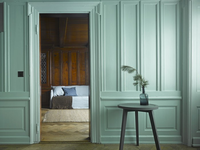
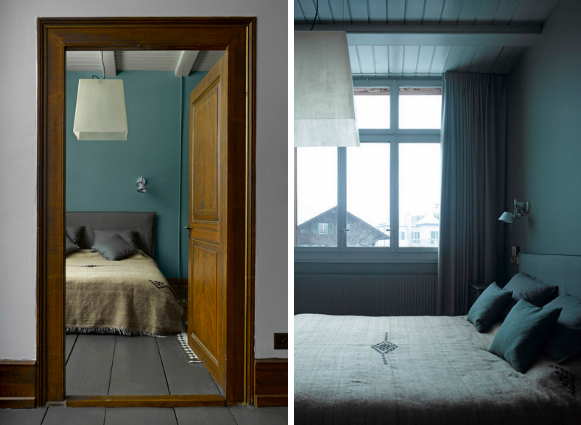
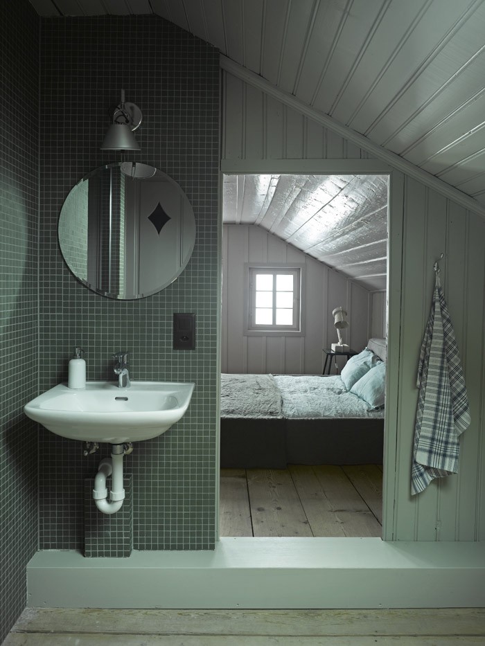
I had the same warm glow of delight when I found this beautiful Swiss chalet. The designers seem to have skipped that oh-so-familiar stage of painting a hundred swatches on the walls and agonising for months over the perfect shade to use. Instead, they’ve used nearly all of them – forty colours in fact – to create this beautiful canvas of chalky hues.

decorating with tonal colours

decorating with grey paint

grey and yellow dining room

blue painted workspace

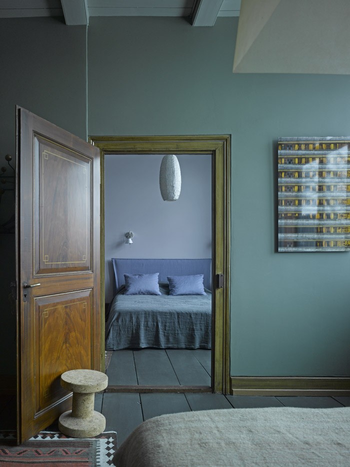
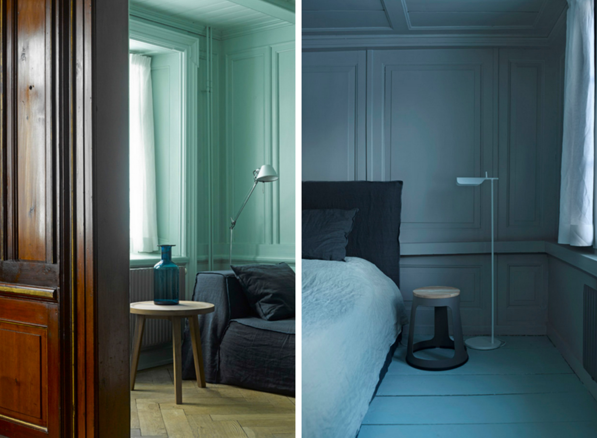
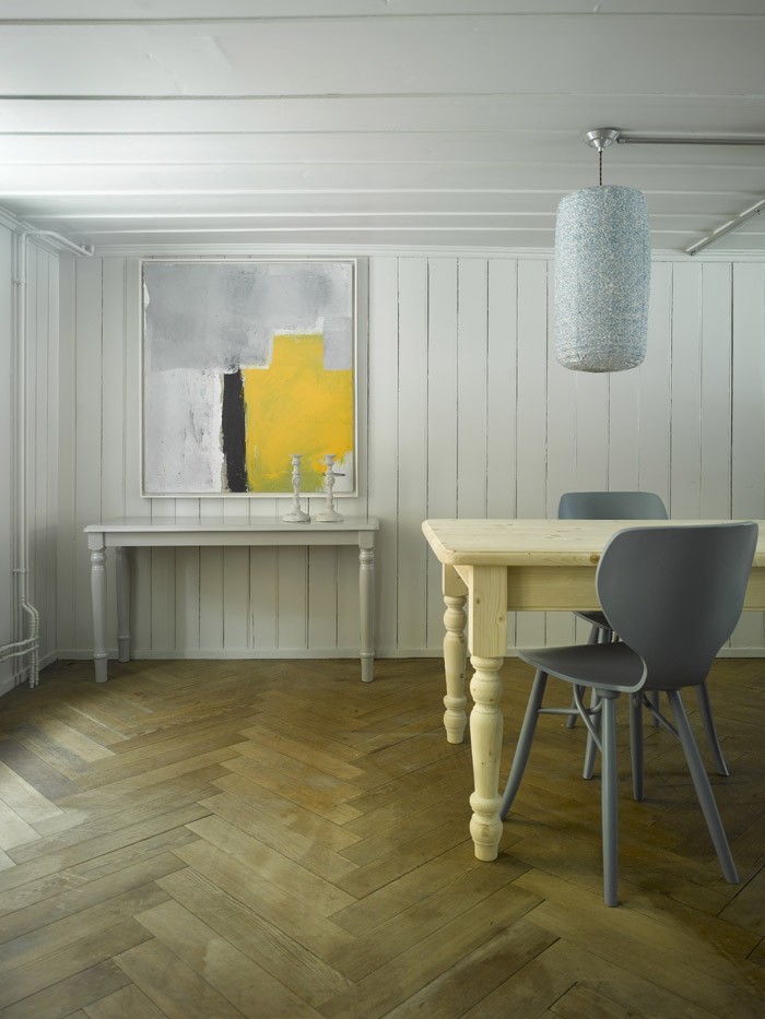
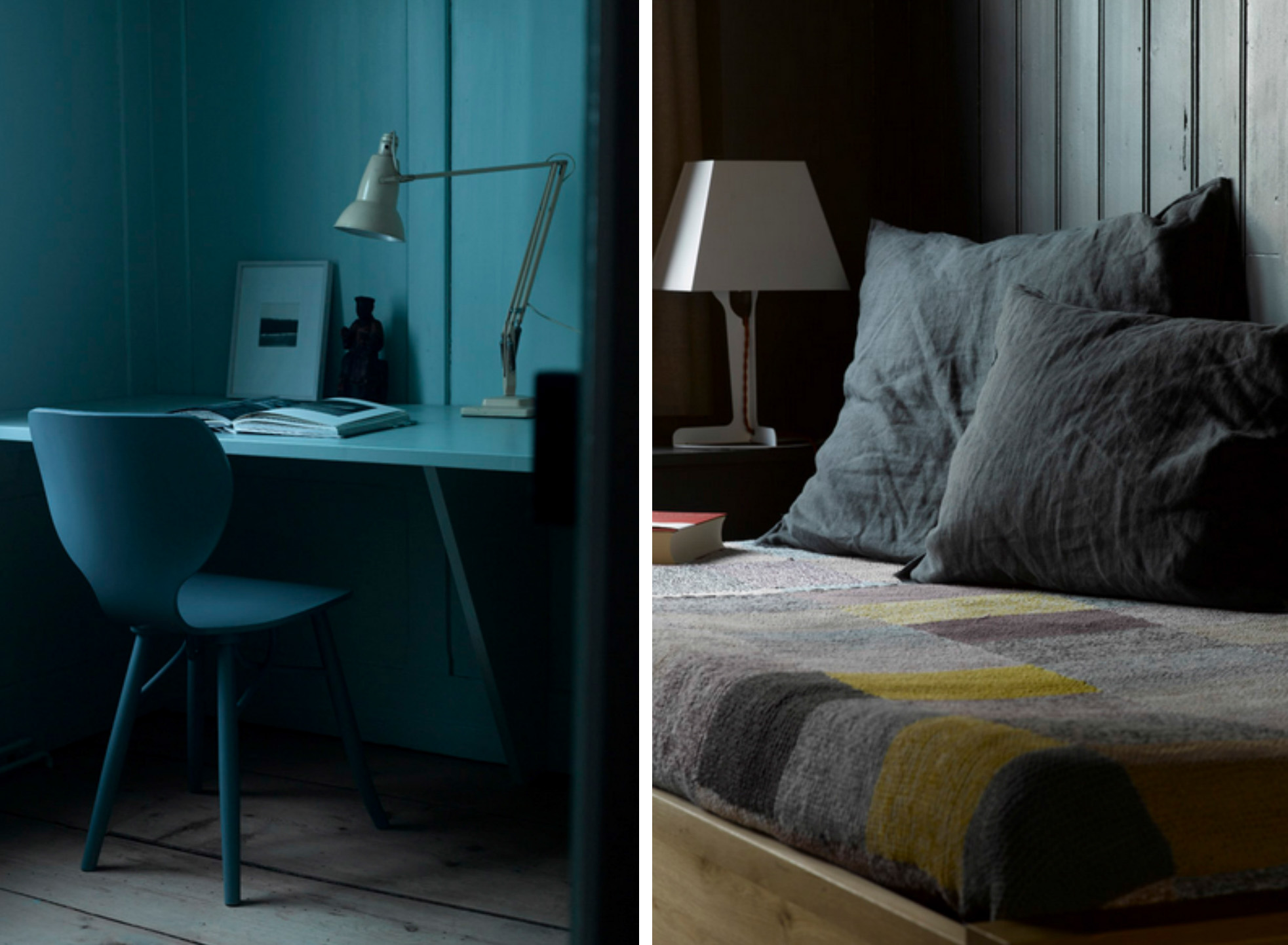
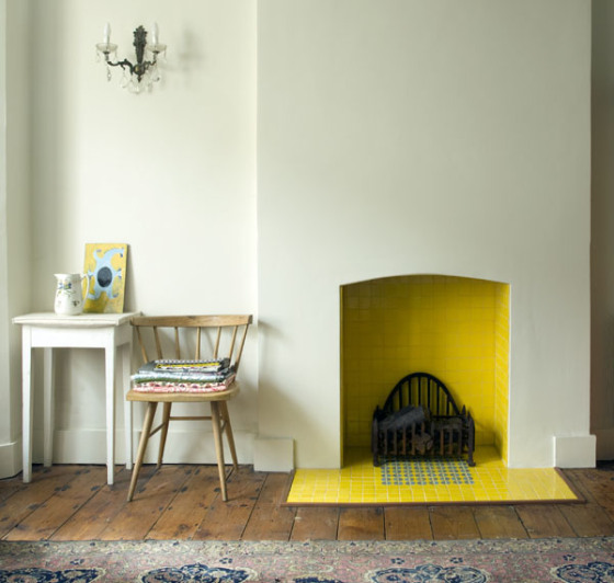
If you’ve been reading this blog a while, you’ll know that in the past I’ve been a bit of a colourphobe. Recently though I’ve found myself embracing colour more and more, and this house completely sums up my decorating tastes right now. The paint palette still packs and punch and each room has serious impact, but the overall mood remains soft and relaxed. I love also how these shades bring out the beauty of the wood in this home – it’s historically sensitive and contemporary all at once. And oh, this mint!

period paint colours in traditional home

tonal bedroom decorating scheme

decorating with soft paint colours{design and photographs all Bergdorf Agency}

Now, I don’t take these things at all lightly, but I actually think this house might just have unseated this Cornish cottage as my Favourite Home Of All Time!

What do you say to that?

Mood of the moment… Kerala calling

14 Jun

Kerala Calling moodboard by Decorator's Notebook

Kerala Calling moodboard by Decorator's Notebook

{LIVE / EAT / WEAR / ESCAPE}

{LISTEN 6 Day Riot We Want You}

Welcome to our new blog series. Pictures curated by Bethan, music selected by Joe. We hope you enjoy it and it gets you in the mood for a beautiful weekend x

City pretty… what colour is yours?

12 Jun

I found these photographs of San Francisco on the beautiful Cachemire et Soie blog thanks to Victoria. The stunning pastel colour palettes created by the architecture reminded me a little bit of The Paris Colour Project and started me wondering what the colour palette of the cities I know would be… or whether there is even one at all?

Photographs of San Francisco colours and architecture

Colours and architecture of San Francisco{all Anne for Cachemire et Soie}

I’ve never been to San Francisco but if you have I’d be interested to know if the whole city is painted like this or if it’s just little a little pocket. When I think of the colours of London my mind’s eye sees something like those Photoshopped black and white photos with just a spot of red highlighted. Grey and red… that’s the palette of London for me. Nowhere near as pretty.

What would be the colour palette of the place you live?

A pretty bedroom (sage and gorse again)

22 May

sage and yellow vintage bedroom ideas{Sean Fennessy for The Design Files}

I still can’t get enough of this colour combo so this delicate bedroom scheme immediately caught my eye. There’s more of this vintage-inspired home at The Design Files.

Fresh new colour combination: sage and gorse

1 May

How’s this for a lovely new colour combination? Softest sage with an unexpected splash of gorse yellow in the fireplace.

yellow fireplace tiles{sorry, unknown}

I’ve blogged loads in the past about my love of yellow and grey, but I feel like I’ve been getting a little sick of that combo recently and this seems a much more sophisticated, grown-up twist. Prettier somehow.

Also, I’ve looked everywhere for the source of this image to no avail – if you know whose home this is please let me know via the comments or email. I would love to make sure the owner of this home is credited for their fabulous eye for colour!

Coloured internal doors. Now there’s a thought.

31 Jan

Checking your incoming links and finding you’ve been added to someone’s blogroll has to be one of the nicest ways to discover a new blog. And it’s even nicer when you get some love from a blog as inspiring as Taking Notes.

I popped straight over and had a good poke around Katrin’s amazing house. A-MA-ZING with capital letters and hyphens and everything. And that’s not even taking into account the picture perfect German village it’s in, or the walled garden, or the fact that garden has a BARN IN IT! House envy? Natürlich.

Inside the renovation is full of lovely little touches, including this one, that’s really got me thinking…

{all  Taking Notes}

I’m sure everyone has those little niggly things about their homes that nag away at them. In Le Flat, that thing is my cheap plywood internal doors. The living room one even has a hole where the handle should be. I know, I know.

Of course, they were the first thing I was going to change when I moved in and two years later they’re still there, taunting me with their god-awfulness. Reclaimed stripped-pine doors would be the obvious replacement, but the reality of my budget means I’ll be plumping for new pine doors that are going to need painting. It had never crossed my mind to use anything other than white / off white, but there is something about this Thatcherite blue that I can’t get out of my head.

This colour-phobe might just be for turning!