Tag Archives: colour

House tour: artist’s home with a bohemian twist

11 Oct

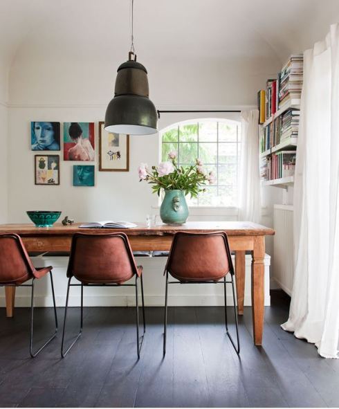
This stylishly comfortable house reminds me of this Sydney home I featured a while back… they both work for all the same reasons. A crisp white canvas filled with unusual, casually-arranged finds from around the world.

Ethnic Dutch home via The Style Files

dining room with industrial light VT wonen

display of global treasures

close up of woven rug

relaxed ethnic home via VT Wonen

Dutch home with mezzanine VT Wonen

{James Stokes for VT Wonen via The Style Files}

I can just imagine feeling really welcome and comfortable in this home… although it also makes me want to travel again! If you like what you see too, there are a few more pictures over at The Style Files.

Have a lovely weekend!

House tour: officially my new Favourite Home Of All Time

29 Jul

There are few things that please my inner decorator more than a crisp new Farrow & Ball colour chart. The thick concertina of cardboard fanning open to reveal subtley shaded chips of painty gorgeousness inside. Such a treat!

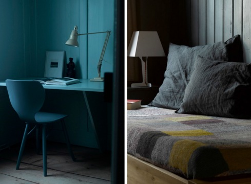
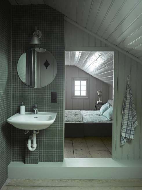
I had the same warm glow of delight when I found this beautiful Swiss chalet. The designers seem to have skipped that oh-so-familiar stage of painting a hundred swatches on the walls and agonising for months over the perfect shade to use. Instead, they’ve used nearly all of them – forty colours in fact – to create this beautiful canvas of chalky hues.
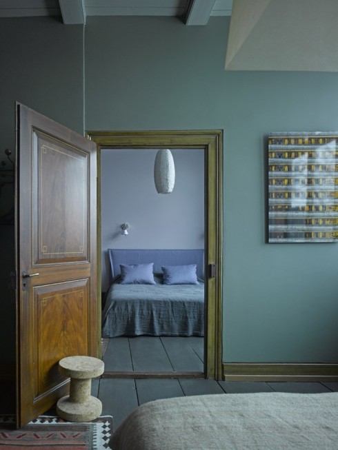
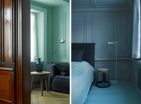
decorating with tonal colours

decorating with grey paint

grey and yellow dining room

blue painted workspace

If you’ve been reading this blog a while, you’ll know that in the past I’ve been a bit of a colourphobe. Recently though I’ve found myself embracing colour more and more, and this house completely sums up my decorating tastes right now. The paint palette still packs and punch and each room has serious impact, but the overall mood remains soft and relaxed. I love also how these shades bring out the beauty of the wood in this home – it’s historically sensitive and contemporary all at once. And oh, this mint!
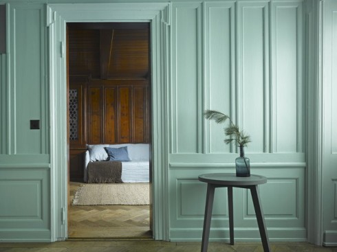
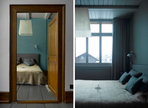
period paint colours in traditional home

tonal bedroom decorating scheme

decorating with soft paint colours{design and photographs all Bergdorf Agency}

Now, I don’t take these things at all lightly, but I actually think this house might just have unseated this Cornish cottage as my Favourite Home Of All Time!

What do you say to that?

Mood of the moment… Kerala calling

14 Jun

Kerala Calling moodboard by Decorator's Notebook

Kerala Calling moodboard by Decorator's Notebook

{LIVE / EAT / WEAR / ESCAPE}

{LISTEN 6 Day Riot We Want You}

Welcome to our new blog series. Pictures curated by Bethan, music selected by Joe. We hope you enjoy it and it gets you in the mood for a beautiful weekend x

City pretty… what colour is yours?

12 Jun

I found these photographs of San Francisco on the beautiful Cachemire et Soie blog thanks to Victoria. The stunning pastel colour palettes created by the architecture reminded me a little bit of The Paris Colour Project and started me wondering what the colour palette of the cities I know would be… or whether there is even one at all?

Photographs of San Francisco colours and architecture

Colours and architecture of San Francisco{all Anne for Cachemire et Soie}

I’ve never been to San Francisco but if you have I’d be interested to know if the whole city is painted like this or if it’s just little a little pocket. When I think of the colours of London my mind’s eye sees something like those Photoshopped black and white photos with just a spot of red highlighted. Grey and red… that’s the palette of London for me. Nowhere near as pretty.

What would be the colour palette of the place you live?

A pretty bedroom (sage and gorse again)

22 May

sage and yellow vintage bedroom ideas{Sean Fennessy for The Design Files}

I still can’t get enough of this colour combo so this delicate bedroom scheme immediately caught my eye. There’s more of this vintage-inspired home at The Design Files.

Christmas wishes from Decorator’s Notebook x

25 Dec

vintage illustration Christmas party{via Jill Clark}

May your days be merry and bright!

All my love for a wonderful Christmas and a fantastic 2013

DN xxx

Print & Pattern

7 Oct

I don’t think I’ve ever grown out of that ‘back to school’ feeling so I usually try and sign up to an evening class at this time of year to keep my brain cells ticking over and my creativity alive as the nights draw in.

This year I’m doing a beginner’s class in silkscreen printing at Morley College in Lambeth. We’re starting off with basic stencil prints so for my homework I’ve been gathering simple patterns for inspiration.

{Diamond Dogs / Clouds and Bolts / Leaves}

{Feathers / Trees and Birds / Glasses / Blue Clouds}

{Circles / Chevrons / Coffee Beans}

I could go on and on – there are so many talented printmakers out there. Not sure how far I’ll be able to get in twelve weeks but I’m hoping the learning curve will be a fun one! I’ll be sure to share the results with you.

Swedish summer textiles by Gudrun Sjoden

9 Apr

When I think about Scandinavian style, the first thing that pops into my head is white. Simple white wood houses, chalky accessories and a few natural touches. Not the dazzling array of colours and patterns offered by Swedish textile designer, Gudrun Sjödén.

Gudrun has been designing fabrics for clothing and homes for over 35 years, but they’ve only just become available here… I went along to the launch of the very first British shop on Monmouth Street last week and you’ll also be able to order online or through the very beautiful printed catalogue. The shop itself is a bit Anthropologie-esque with fashion and homeware displayed together in colour co-ordinated groups, with plants, flowers and vintage artifacts nestled amongst them.

Nature (especially Gudren’s gorgeous garden) is a major source of inspiration, and bright flowers, birds and fruits and vegetables feature heavily. As well as home accessories there are ready-made curtains and metre fabric too in case you fancy whipping up your own designs.

{all Gudrun Sjödén}

Next time you’re in Covent Garden it’s well worth popping into the new shop – in the meantime, have a flick through Gudrun’s beautiful summer sketchbook to find out how the designs came about.

Are these bold and bright patterns to your taste and how do you think British shoppers will take to them?

O is for Ombre

6 Apr

You might not know it by this name, but you’ll certainly have noticed this trend. Also referred to as dip-dye or graduated colour, ‘ombre’ has found its way into everything from fashion and flowers to fabrics and food.

Here are a few of my favourite pins… I hope you find them inspiring too.

{Apartment Therapy via Pinterest}

{Design Sponge via Pinterest}

{Etsy via Pinterest}

{Glorious Treats via Pinterest}

{Lace and Likes via Pinterest}

I really love this trend – it’s pretty and feminine without feeling too fussy. Have a lovely long weekend everyone and see you again on the other side of Easter!

……………………………………………………………………………………………………………………………………………………………………..

You might also like these posts:

E is for Ephemera

Gorgeous Indian summer colours

And don’t forget you can follow Decorator’s Notebook on Pinterest too for daily snippets of inspiration

Join The Room Debate!

2 Mar

Welcome back to the Decorator’s Notebook Room Debate. I have something that might be a little controversial for our perusal today.

As always, it’s easy to take part. Just have a good look at the room photo below and leave a comment with your answers to these two questions:

One thing I like most about this room is…

One thing I like least about this room is…

{via Habitually Chic}

I’ve started things off in the comments below… can’t wait to hear what you think of this one!

Have a lovely weekend.